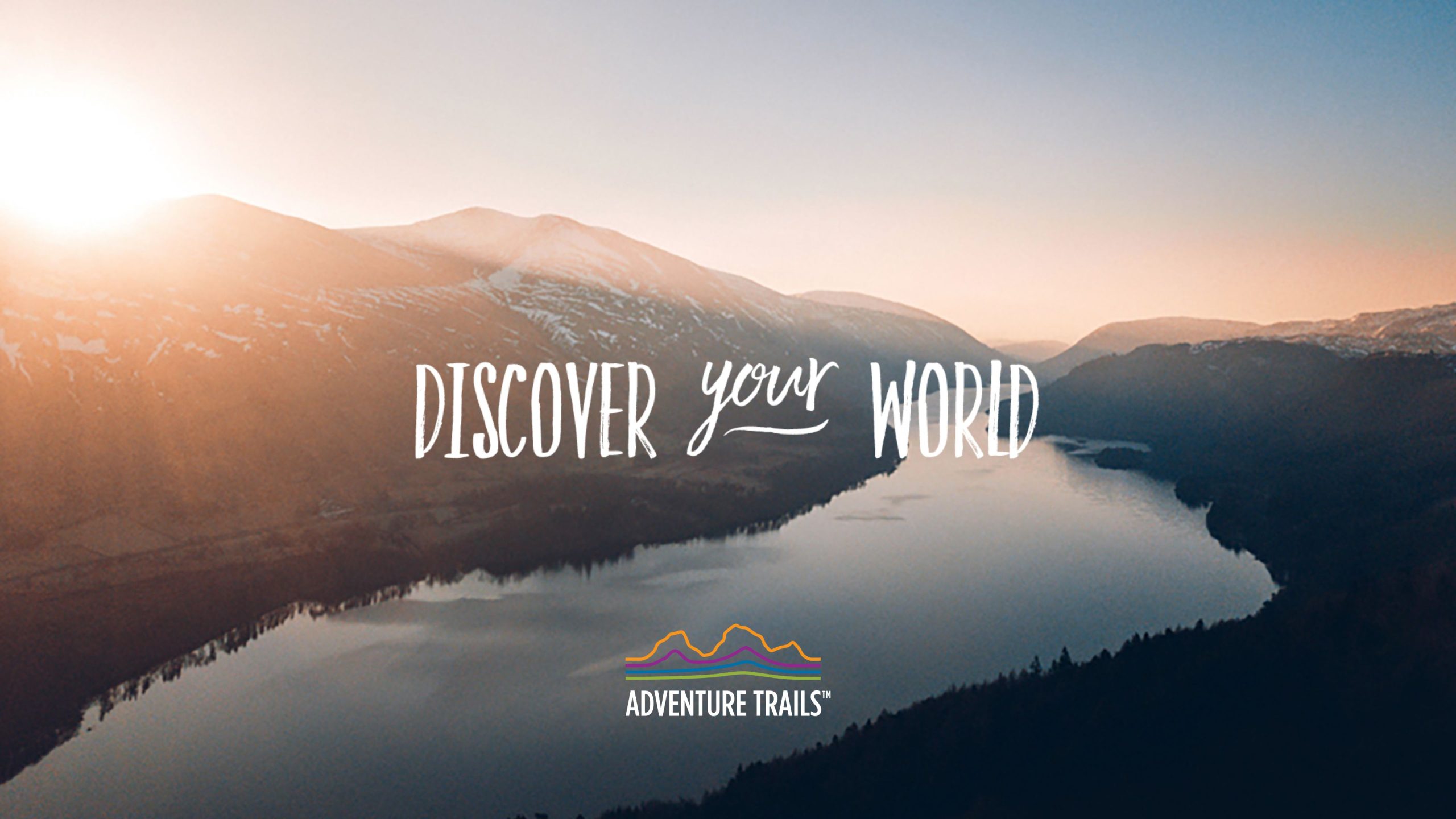
Founded by Sean Bowland, Adventure Trails was born from a genuine passion for the great outdoors and a desire to make adventure accessible to everyone — whatever their fitness, ability or confidence.
Sean wanted a brand that captured the freedom, exploration and sense of adventure that sits at the heart of what he does. With the Lake District right on our doorstep, the surrounding landscape provided the perfect inspiration for the identity. The logo uses four flowing contour lines, reflecting the fells and trails that make the Lake District such a unique place to explore.
Alongside the identity came the strapline ‘Discover Your World’ — a simple invitation to get outside, explore somewhere new and experience an adventure of your own.
Branding
Print
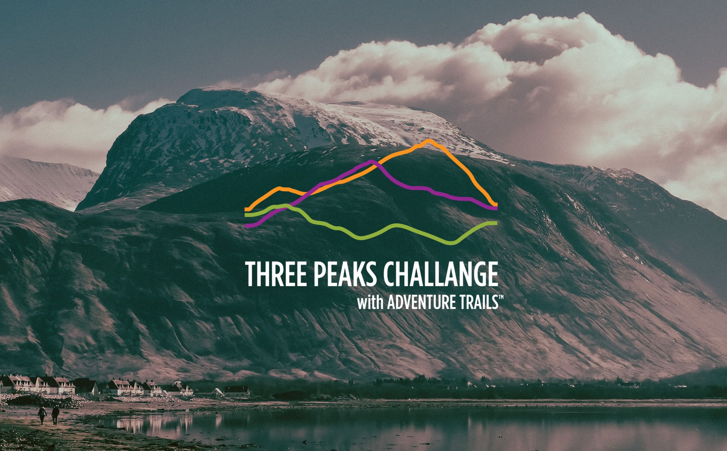
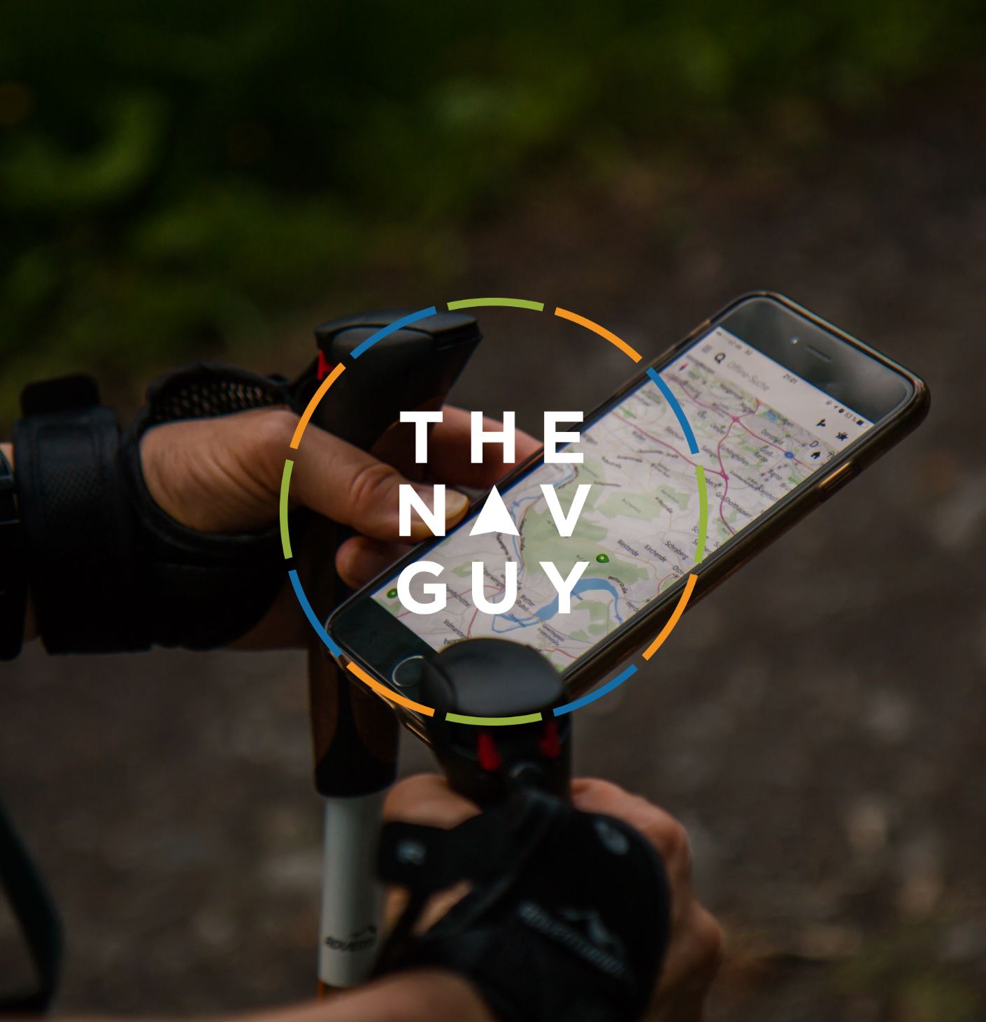
As Adventure Trails grew, Sean also wanted distinctive identities for two of his key sub-brands: The Nav Guy and Three Peaks Challenge.
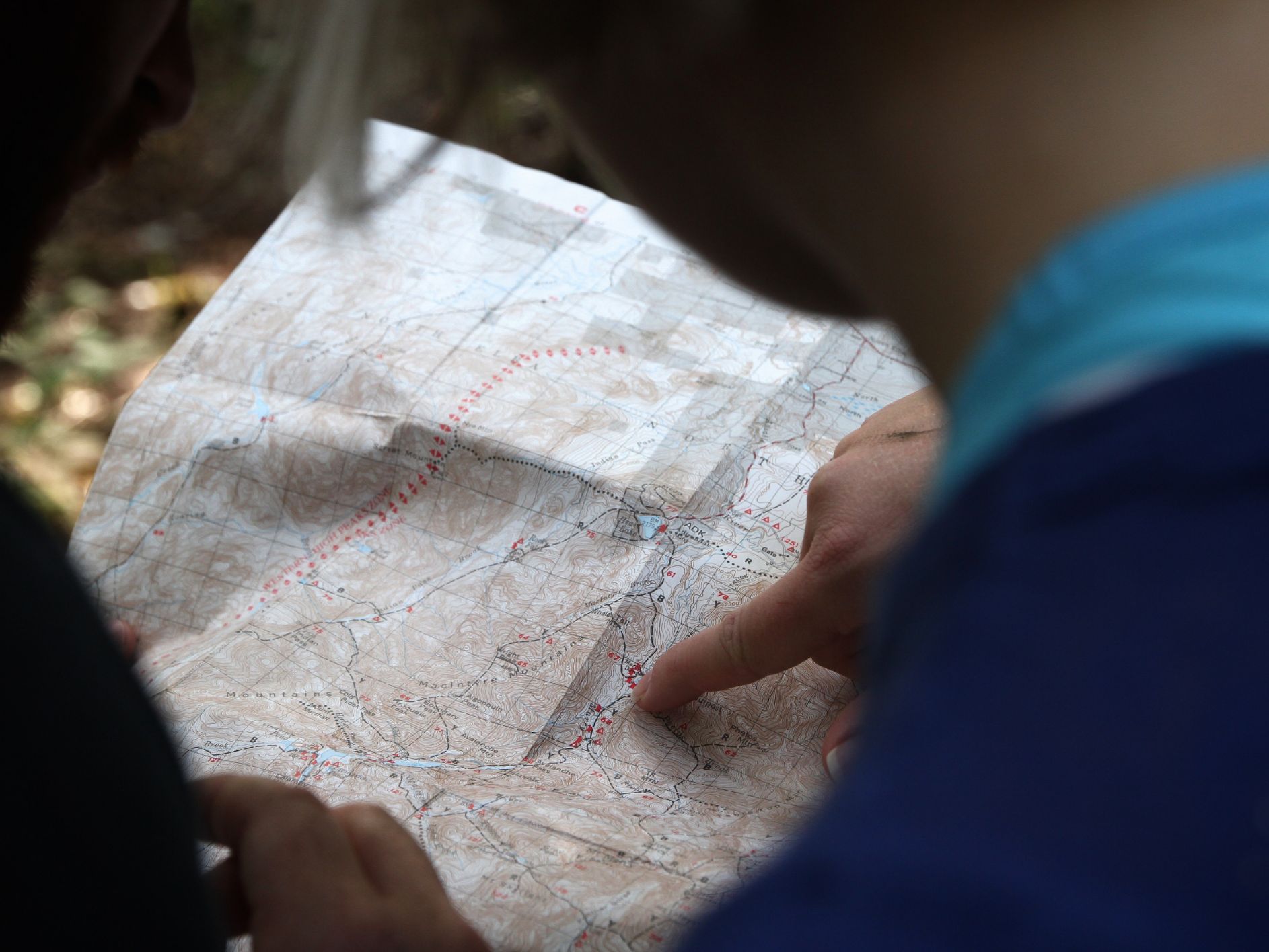
For The Nav Guy, the brief was to create something no-nonsense, practical and highly effective, just like the navigation and map-reading training itself. Using the Adventure Trails colour palette and taking inspiration from Sean’s favourite fell-running compass, the Silva 6 Jet Spectra, the new identity was created.
Three Peaks Challenge is one of Adventure Trails’ most popular events, so it needed an identity of its own while still feeling connected to the parent brand. I developed this by transforming the four contour lines from the Adventure Trails logo into the distinctive contours of the three peaks — creating a simple, recognisable mark with a clear connection to the original brand.